This guide demonstrates how to create an interactive combination of stacked and radial bar charts in Power BI using native visuals. I first developed this visualization as a static design in Excel and PowerPoint for my Onyx Data challenge submission, but later recreated it in Power BI to add dynamic interactivity.

Use Cases
Combining two charts into a single visual efficiently delivers multiple insights to stakeholders. In this case study, a 100% stacked bar chart shows how each business line contributes to category expenses, while radial bars display the actual operating expense amounts by category. This dual visualization helps stakeholders quickly understand both the total expenses per category and the proportion contributed by each business line. Such comprehensive information enables better decision-making about whether to adjust spending across specific categories and business lines.
Limitations
Creating complex visualizations in Power BI can be challenging when working with native visuals. While I achieved satisfactory results in this project, the process was time-consuming, particularly when building radial bar charts.
Since Power BI lacks native support for radial bar charts, we must construct them manually using donut charts and multiple DAX measures to represent each category. For this case study, I designed 3/4 radial bars to prevent overlap with the stacked bars. To view the values across all categories in the radial bars, custom tooltips are necessary, as the default tooltip can only display values from one category at a time due to the stacked donut chart structure.
One limitation of manually constructed radial bar charts is the inability to dynamically sort categories by value. We’re limited to either alphabetical ordering or manual sorting based on overall category totals. While I chose to sort by total values in this case study, it’s important to note that category rankings may shift when using slicers, and the radial bar chart won’t automatically reflect these changes.
About the Case Study
This visualization uses data from the Onyx Data August 2024 challenge on business financials. You can replicate this analysis by downloading the dataset.
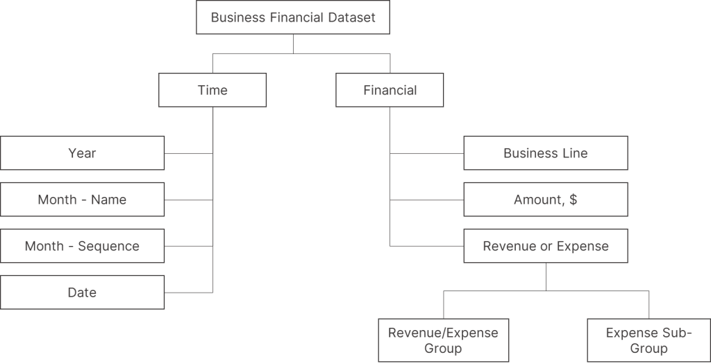
The dataset examines financial data from a sports business with three distinct business lines. It breaks down both revenue and expenses into progressively detailed groups and subgroups across multiple columns, as illustrated below:
For this case study, we’ll create a combined visualization that merges stacked and radial bar charts to analyze operating expenses. The 100% stacked bars will show how business lines contribute to each expense category, while the radial bars will display the total expense amount per category (expense sub-group). This dual approach provides a comprehensive view of both relative contributions and absolute values.
Step 1: Generating the 100% Stacked Bar Chart
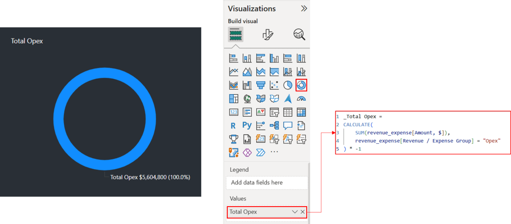
Create a 100% stacked bar chart by starting with a measure to calculate total operating expenses. Multiply expense values by -1 to convert the negative values into positive ones for easier visualization (skip this step if your dataset already shows expenses as positive values).
_Total Opex =
CALCULATE(
    SUM(revenue_expense[Amount, $]),
    revenue_expense[Revenue / Expense Group] = "Opex"
) * -1
Build the chart by placing the [Total Opex] measure on the x-axis, the [Revenue/Expense subgroup] column on the y-axis, and the [Business Line] column in the legend. Format the [Total Opex] measure to display as a percentage of the grand total, which will show your data labels as percentages. Then, customize the colors for each business line to match your design preferences. To accommodate the radial bar chart that we’ll add later, position the series labels on the left side of the bars. This layout creates space for the radial chart on the right side of the visualization.

Step 2.1: Constructing the First Version of Radial Bar Chart
Since Power BI doesn’t natively support radial bar charts, we’ll create them manually using stacked donut charts. Each donut chart represents a category, and the number of categories determines the number of donut charts needed. In this example, we’ll visualize six operating expense categories (Payroll, Equipment, Marketing, Rent, R&D, and Other), requiring six donut charts.
| Category | Amount | % of Grand Total |
| Payroll | $1,790,000 | 31.9% |
| Equipment | $1,333,000 | 23.8% |
| Marketing | $1,055,000 | 18.8% |
| Rent | $745,000 | 13.3% |
| R&D | $540,000 | 9.6% |
| Other | $141,800 | 2.5% |
| Total | $5,604,800 | 100.0% |
This initial radial bar chart will show each category’s operating expense as a proportion of the total operating expense. This percentage acts like a progress bar within the radial bar. We’ll repeat this process for all six categories, creating six donut charts that, when combined, form the radial bar chart.
To begin, we’ll define a measure. Donut charts aggregate values when a measure is added. Simply placing the [Total Opex] measure on the chart will display it as 100% since no other measure is added.
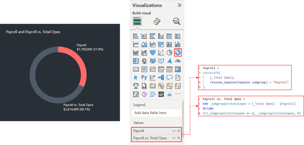
Let’s define a measure to calculate operating expense for “Payroll” category and add this measure to the chart again. We now see that these two measures are added to make up for 100% chart.
Payroll =
CALCULATE(
    [Total Opex],
    revenue_expense[Expense subgroup] = "Payroll"
)
The current donut chart visualizes the combined [Total Opex] and [Payroll], which together equal $7,394,800. Consequently, [Total Opex] comprises about 75.8% of the chart, and Payroll about 24.2%, reflecting their respective contributions to the total. However, what we are trying to achieve is to represent [Total Opex] as the full chart, with [Payroll] as a portion of that total.
To accomplish this, we need to calculate the difference between [Total Opex] and [Payroll]. This difference will be displayed as the ‘unfulfilled’ section of the donut chart, while Payroll will represent the ‘fulfilled’ section, effectively creating a progress bar visualization.
Because donut chart segments cannot overlap, we must subtract Payroll from [Total Opex] to achieve this visualization. This means the chart shows proportions, not the actual values. We will address this limitation by adding custom tooltips that display the true values.
Payroll vs. Total Opex =
VAR _subgrouplvstotalopex = [_Total Opex] - [Payroll]
RETURN
IF(_subgrouplvstotalopex >= 0, _subgrouplvstotalopex, 0)
This DAX formula calculates the remaining Total Operating Expenses (Opex) after subtracting Payroll, ensuring the result is never negative.
The donut chart accurately represents the proportions of the two measures. However, we face the challenge of fitting a stacked bar chart alongside it. This requires reducing the donut chart to three-quarters of a circle. Since Power BI doesn’t provide a direct way to control the donut’s arc, we’ll need a workaround.
We begin by defining a DAX measure to calculate one-third of the total value:
Payroll_Dummy = ([Payroll] + [Payroll vs. Total Opex]) * (1/3)This calculated measure, when added to the donut chart, occupies exactly one-third of the circle, as shown below. Our objective is to create a three-quarter donut chart. Because we cannot directly hide this one-third portion or make it transparent, we achieve the desired effect by setting its color to match the background.

To visualize other categories, we simply replace [Payroll] with the respective category and repeat the process.
Step 2.2: Constructing the Second Version of Radial Bar Chart
The second radial bar chart uses a similar approach to the first, but with a different underlying measure. This chart visualizes each category’s operating expense relative to the category with the highest expense. The category with the highest expense is represented as 100% of the chart.
While Payroll currently has the highest operating expense, this may change with slicer interactions. Therefore, the measure must dynamically identify the highest expense category for each selection and use it as the 100% reference point.
To accomplish this, we define a measure that checks if each category represents the highest operating expense. If a category is the highest, the measure returns zero (no variance). If not, it calculates the difference between the highest expense and the category’s expense. This difference serves as the portion to be “subtracted.” The DAX measure for “Payroll” category is:
Variance_Payroll & Highest Opex =
IF(
    [_Highest Opex] = [Payroll],
    0,
    [_Highest Opex] - [Payroll]
)
We first calculate the highest operating expense across all categories using the following DAX measure:
_Highest Opex =
MAXX(
    VALUES(revenue_expense[Expense subgroup]),
    [_Total Opex]
)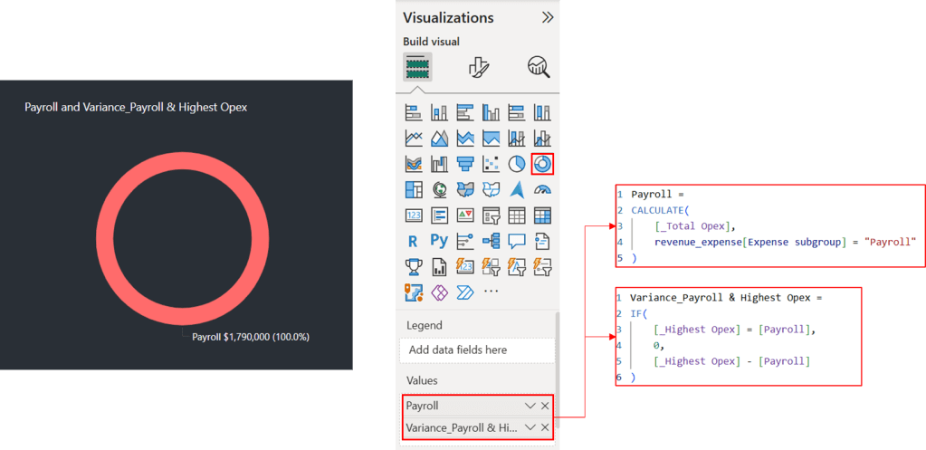
As you can see, the donut chart shows only Payroll. This is because the [Variance_Payroll & Highest Opex] measure has identified [Payroll] as the category with the highest operating expense. Let’s examine a scenario with a different category.

Since Marketing is not the highest expense category ([Payroll] was previously), a variance is calculated. This variance is the difference between the highest expense ([Payroll]) and the Marketing expense. We’ll apply the same approach to the remaining categories.
We reduce the circle to three-quarters of its full size to make room for a 100% stacked bar chart. To do this, we first define a measure that calculates, for each category, the sum of its expense and its variance from the highest operating expense (if any). The DAX measure for “Payroll” category is:
Payroll_Dummy_2 = ([Payroll] + [Variance_Payroll & Highest Opex]) * (1/3)Two options are available: adding this measure directly to the visualization or combining it with the variance measure defined earlier. Because we intend to make this measure visually transparent by matching its color to the background, combining the two measures is recommended to avoid displaying dividers between series.
Payroll_Helper = [Variance_Payroll & Highest Opex] + [Payroll_Dummy_2]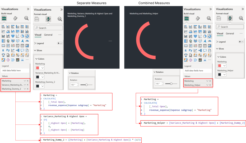
Because we want the radial bar charts on the left and the 100% stacked bar chart on the right, we adjust the rotation of each radial bar chart to 180 degrees clockwise, starting at the bottom. The stacked bar chart’s series labels and legend are placed on the right.
Step 3: Bringing It All Together

After creating the donut charts for each category, the next phase involves constructing the radial bar chart by integrating these elements. The main challenge is to precisely match the radial bars’ dimensions with the stacked bars to create a seamless appearance. Here’s the step-by-step process:
First, individually adjust each donut’s dimensions through the Properties > Size panel. It’s crucial to maintain a square aspect ratio (1:1) to facilitate future adjustments.
Next, modify the inner radius of each donut chart using the Slices > Spacing panel. As you work inward with progressively smaller charts, reduce the spacing proportionally. Fine-tune these measurements to align with the stacked bars. You may also need to adjust the spacing between categories in the stacked bar chart to ensure consistent widths across both visualizations.
Then, center-align each donut chart both horizontally and vertically to create the stacked radial bar formation. Arrange categories with the highest expenses on the outer rings and the smallest expenses toward the center.
Finally, disable the “Snap to Grid” feature to allow precise positioning when aligning with the 100% stacked bar chart.
Step 4: Designing a Custom Tooltip
The final step is creating the radial bar chart tooltip to display all category values. Add a new report page and set its canvas size to 240×240 pixels (the default tooltip size is too large).


Thank you for reading!
I hope this case study provided valuable insights and sparked your interest. Please feel free to connect with me on LinkedIn or via email if you have any questions or would like to discuss this further.

Leave a comment